
I’m a little behind on my television viewing at the moment (it’s the downside of trying to get a book ready for publishing), but all work and no play makes Allie a dull girl. Therefore I managed to squeeze in an episode of Saturday Night Live a few days after it aired. Unfortunately for me, most of the episode proved to be like eating a bland cookie when you are trying to diet (nice to look at, but not worth the calories) with the exception of one featured short film toward the end.
The film was about a person who has grown obsessed with the font chosen for the film, Avatar called Papyrus. Or rather it is about the person’s obsession about why that particular font, out of all the fonts available, was chosen “like a careless child,” for such a marquee event.
My husband looked at me as the joke continued to play out for the next three minutes. “This must be for people like you.”
By ‘people like me’ he meant people who respond to every school presentation whether it be the PTA’s fundraising plans, faculty procedures, or a teacher’s syllabus, due to letters projected on the screen being written in Comic Sans like Joan Crawford (played by Faye Dunaway) seeing wire hangers in Mommie Dearest. (I wish I could say I was exaggerating, but I am not.)
People who understand that fonts can set the tone as much as any background art.

People, whose fixation on fonts has the potential to topple governments.
Yes. Seriously.
This summer it was revealed that the daughter of Nawaz Sharif, the Prime Minister of Pakistan, allegedly forged documents downplaying the involvement in a London real estate deal after the legality of the family’s income sources were questioned.
How was it determined the documents she presented were forgeries?
Because the font used, Calibri, now a Microsoft Word default, wasn’t available the year the documents were supposed to have been created and people noticed it. (Source: The Guardian, “‘Fontgate’: Microsoft, Wikipedia and the scandal threatening the Pakistani PM”.)
People who can be called designerds (emphasis on the nerd), as I saw one fellow font-ficionado dub herself.
In other words, font selection matters. Maybe not to you, but it does to someone out there in the audience (and effective presentations are all about the audience), so pick your fonts with care and use them wisely.

From Visually.
Some tips to keep in mind whether you are writing a book, making a poster, or creating a presentation for work:
- Sans Serif fonts are easiest to read from far away, such as on a poster, or in fine print because they have a uniform thickness. (Examples include Helvetica, Avant Garde, Arial, and Geneva)
- Serif fonts, however, are easier to read as bulk text close up on a page because their distinctive shapes help our brains identify the letter faster, therefore costing less brainpower to process. (Examples include Times Roman, Courier, New Century Schoolbook, and Palatino)
- Distinct\Display\Decorative fonts are highly stylized or highly decorative and are eye-catching and mood setting, but can be hard to read. They make the reader use extra brain power to process, so use sparingly. It’s also best not to use more than one distinct font at a time. (Examples include Jokerman, Stencil, Curlz, and Chiller)
- Different fonts can be used together on a single page, but don’t use more than two or three. (This is unless you are writing a children’s book).
While most people can get by utilizing default fonts available on a computer, you can always add more. Word of caution – not all fonts are free to use in every format. Some require licensing for their use the same as stock art or custom photography.
Also, I do not recommend utilizing non-standard fonts for editable documents that will be distributed electronically unless you are tech savvy enough to know how to embed the typography into the document itself. Otherwise, the recipient might see nothing but squares on their end.
That being said, if you still would like to up your project with flashy letting, my favorite site for collecting new fonts is www.fontsquirrel.com. In addition to having a large selection of typography to choose from which you can test drive before downloading, it has a font matching tool. See a font you like? Upload an image and it suggests a number of similar fonts.
Others good sites for fonts are www.fontspace.com and www.dafont.com.
Overwhelmed by options? You can also find a short list of some of the best at The Creative Bloq.
Or keep it simple. You can do a lot to set your text apart with a single font by changing its size, weight (normal, bold), spacing, or style (italics). The choice is up to you. Just don’t choose Comic Sans for the body of your text.
I beg you.

I love this post!
What font are you going with in the book you’re getting ready to publish?
LikeLiked by 1 person
🙂 For branding purposes I can’t play around too much as this is a sequel. I went with Garamond for the bulk of my interior, though I have used Palatino on other projects. The cover is a mix of Trajan Pro and Bebas Neue.
LikeLiked by 1 person
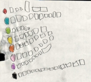
I love this post. I took what was called Printing [would now be called Graphic Arts] when I was in high school. It was an elective that made me aware of visual clarity, different fonts & the importance of mixing typefaces judiciously. I can’t id fonts like a true nerd– but I know when they’re put together wrong and it bugs me. The “font you are using” chart you shared is wonderful. *tee hee*
LikeLiked by 1 person
I cracked up reading that chart as well. I can’t identify them all by name them all either as there are so many out there, but will obsess over a bad match far longer than I probably should.
LikeLiked by 1 person
Great, great post about fonts. I also love the covers and fonts of The Deer! Beautifully illustrates your point. Your post reminds me of two font-related things. One, in the show The Middle, the youngest son Brick is a huge reader and gets himself very worked up over fonts (in general). In one funny episode he can’t leave Disney’s shop with a personalized Mickey Mouse hat because the amount of thread color and font choices overwhelm him. The family leaves him there to ride rides without him. Funny. And two is this makes me think of a wonderful book I read called Mr. Penumbra’s 24 Hour Bookstore by Robin Sloan. I cannot recommend this book enough. It’s one of my favorite books. Another thoughtful post, as usual, Allie!
LikeLiked by 1 person
🙂 I broke a couple cover design rules with those, but it was a fun illustration to make all the same.
I’ve never heard of Mr. Penumbra’s 24 Hour Bookstore. I’ll have to check it out. Thanks for the recommendation!
LikeLiked by 1 person
I can get completely obsessed with fonts but I try to keep a reign on myself!
LikeLiked by 1 person
They are so addictive!
LikeLike
That was too fun! And Wonton and Helvetica on that chart are my faves, though it’s a tough call. That was brilliant. This was a PSA!
LikeLiked by 1 person
I giggled so much when I found that infograph. I had to share it.
LikeLike
We readers thank you. 🙂
LikeLiked by 1 person
I enjoyed the SNL thing, too, by the way. Yeah, that show is hit or miss. Mostly miss, but that clip was really well done and funny.
LikeLiked by 1 person
I watch it mostly for the shorts and weekend update.
LikeLiked by 1 person
Yeah, those are the only good ones. I’ve occasionally watched clips online.
LikeLiked by 1 person
I am very fussy about my fonts, particularly on my blog. I love typography. I have spent hours pouring over typography design looking for something suitable for Swanskins cover, but haven’t found it, and can’t afford to commission a designer. So I completely understand your obsession…
LikeLiked by 1 person
Totally know what you mean. Like cable tv – so many choices and yet you can’t seem to find anything on that fits your mood.
LikeLike
Haha! Always. That’s why I’ve given up on tv. Rarely watch it.
LikeLiked by 1 person
Oh my goodness, Allie, I have never thought about fonts before. Something new for me to consider [read as obsess about]. Smile.
LikeLiked by 1 person
Welcome then to my world 🙂
LikeLiked by 1 person