How to amaze friends and edit images for free with Sumopaint

How to amaze friends and edit images for free with Sumopaint - www.alliepottswrites.com #graphicdesignEarlier this year I featured a mock-up movie poster based on a conversation I’d had with my youngest son. The image produced more comments than anything else I’d published that day. It was a good reminder as to the importance good visuals play in getting a message across.

In full disclosure, I created that image using the Adobe Creative Suite of products, which are powerful, professional grade tools, however, I wanted to find out if I could create similar images with easier to use (and less expensive) applications. Because – why not?

My selection criteria

  • Must be able to use masks and layers – This eliminated Microsoft Paint (to be fair, Paint was never really in consideration)
  • Must be able to edit photos (meaning change colors, erase bits, etc. not just add filters) – This eliminated Canva
  • Must be able to upload as well as download edited images without a subscription – This eliminated PicMonkey

For those of you unfamiliar with the terms above, layers allow you to move and edit isolated elements of a design while masking aids with an element’s transparency and shape.

The experiment

I found Sumopaint and clicked on it’s “Try Online” option. (Note – Sumopaint does require Flash so may not be available on all devices)

SumoPaint Screen ShotI expected another window to open, but instead, a screen similar in appearance to Microsoft Paint appeared at the bottom of my browser window.

For the purpose of this trial, I planned to add and edit multiple image layers, adjust transparency (opacity), add text, and alter an image’s size and shape (free transform tool).

Now, I had to upload the first image to edit.

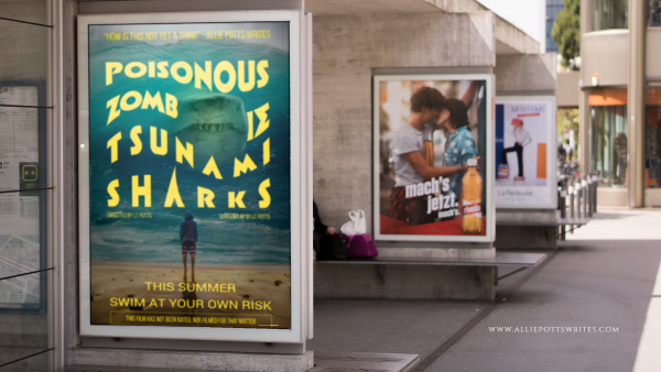
I found a nice background photo from www.pixabay.com showing a number of posters hanging in a row. I then used the File>Import To Layer Command to import my mock movie poster for Poisonous Zombie Tsnumani Sharks. SumoPaint automatically created a new layer.

My poster was originally larger than the background. I resized it using CTRL+T which is the shortcut for the Free Transform Tool.

I recommend you resize your image immediately upon import as SumoPaint has a tendency to crop out anything exceeding your window otherwise.

How to amaze friends and edit images for free with Sumopaint - www.alliepottswrites.com #graphicdesign

I wanted my poster to go where the map was in the original image, but I also wanted it to look like it was behind the frame.

I moved the layer with the Poisonous Zombie Tsunami sharks to the back so as not to mess it up as I worked on the map.

I selected the layer with sidewalk frames and used the eraser tool. Unfortunately, rather than creating a transparent area as I expected, this resulted in a white area.

Ultimately, I was able to find a workaround by selecting everything in the background image except the white area where the map had been and copying and pasting it as a third layer.

A little decrease in brightness here, a little blur there, and a little more adjustment using the Free Transform>Distort tool and voila.

The results

How to amaze friends and edit images for free with Sumopaint - www.alliepottswrites.com #graphicdesign

Having passed my initial test, I decided to try out some of SumoPaint’s additional features such as its filters, color, and text adjustments as well as layer effects resulting in some other mock-ups.

How to amaze friends and edit images for free with Sumopaint - www.alliepottswrites.com #graphicdesign
The planet was created with gradients and 3D filters
How to amaze friends and edit images for free with Sumopaint - www.alliepottswrites.com #graphicdesign
The scales were made using a rock texture which I then recolored
How to amaze friends and edit images for free with Sumopaint - www.alliepottswrites.com #graphicdesign
The font for the title is Impact which I then stretched for well… um… greater impact.


Of course, now I want to write the books to go along with all these covers, but that is a problem for another day.

Final Review

Things I like:

  • Can’t beat the price
  • The learning curve is relatively short (compared to Adobe Creative suite)
  • The User Interface was relatively straightforward and easy to navigate
  • The built-in filters can be customized for a unique look
  • Colors and gradient maps can be added and adjusted with a click of a button
  • Text can be stretched, warped, or otherwise transformed, giving it an edge over most other online editing tools

Things I didn’t like:

  • Text can’t be edited once you have released a text box
  • I couldn’t find a way to make the background transparent once an image was loaded short of adding a new layer and deleting the old
  • Layers would only allow for a handful of text boxes before the program became buggy.
  • When transforming an object, the object automatically reverts to 100% opacity until the transform is completed which is problematic if you are trying to distort an object so it matches the shape of something behind it
  • There are no rulers or align tools so object placement requires some guesswork (Canva has a clear advantage here)

While Adobe still remains the gold standard in my mind, it is good to know I have another option when I need to perform quick and easy edits on the fly, and now I hope, so do you.


What the font? A public service announcement

What the font - a public service announcement on why fonts matter - www.alliepottswrites.com
I love sharing everyday stories and finding their lessons, but sometimes I feel compelled to share a lesson you can find a use for almost every day. This is one of those times…

I’m a little behind on my television viewing at the moment (it’s the downside of trying to get a book ready for publishing), but all work and no play makes Allie a dull girl. Therefore I managed to squeeze in an episode of Saturday Night Live a few days after it aired. Unfortunately for me, most of the episode proved to be like eating a bland cookie when you are trying to diet (nice to look at, but not worth the calories) with the exception of one featured short film toward the end.

The film was about a person who has grown obsessed with the font chosen for the film, Avatar called Papyrus. Or rather it is about the person’s obsession about why that particular font, out of all the fonts available, was chosen “like a careless child,” for such a marquee event.

My husband looked at me as the joke continued to play out for the next three minutes. “This must be for people like you.”

By ‘people like me’ he meant people who respond to every school presentation whether it be the PTA’s fundraising plans, faculty procedures, or a teacher’s syllabus, due to letters projected on the screen being written in Comic Sans like Joan Crawford (played by Faye Dunaway) seeing wire hangers in Mommie Dearest. (I wish I could say I was exaggerating, but I am not.)

People who understand that fonts can set the tone as much as any background art.

Have I mentioned I like to make graphics too?

People, whose fixation on fonts has the potential to topple governments.

Yes. Seriously.

This summer it was revealed that the daughter of Nawaz Sharif, the Prime Minister of Pakistan, allegedly forged documents downplaying the involvement in a London real estate deal after the legality of the family’s income sources were questioned.

How was it determined the documents she presented were forgeries?

Because the font used, Calibri, now a Microsoft Word default, wasn’t available the year the documents were supposed to have been created and people noticed it.  (Source: The Guardian, “‘Fontgate’: Microsoft, Wikipedia and the scandal threatening the Pakistani PM”.)

People who can be called designerds (emphasis on the nerd), as I saw one fellow font-ficionado dub herself.

In other words, font selection matters. Maybe not to you, but it does to someone out there in the audience (and effective presentations are all about the audience), so pick your fonts with care and use them wisely.

If You Use this Font, You Are...

From Visually.

Some tips to keep in mind whether you are writing a book, making a poster, or creating a presentation for work:

  • Sans Serif fonts are easiest to read from far away, such as on a poster, or in fine print because they have a uniform thickness. (Examples include Helvetica, Avant Garde, Arial, and Geneva)
  • Serif fonts, however, are easier to read as bulk text close up on a page because their distinctive shapes help our brains identify the letter faster, therefore costing less brainpower to process. (Examples include Times Roman, Courier, New Century Schoolbook, and Palatino)
  • Distinct\Display\Decorative fonts are highly stylized or highly decorative and are eye-catching and mood setting, but can be hard to read. They make the reader use extra brain power to process, so use sparingly. It’s also best not to use more than one distinct font at a time. (Examples include Jokerman, Stencil, Curlz, and Chiller)
  • Different fonts can be used together on a single page, but don’t use more than two or three. (This is unless you are writing a children’s book).

While most people can get by utilizing default fonts available on a computer, you can always add more. Word of caution – not all fonts are free to use in every format. Some require licensing for their use the same as stock art or custom photography.

the wish list
some fonts may be unsupported on this viewer

Also, I do not recommend utilizing non-standard fonts for editable documents that will be distributed electronically unless you are tech savvy enough to know how to embed the typography into the document itself. Otherwise, the recipient might see nothing but squares on their end.

That being said, if you still would like to up your project with flashy letting, my favorite site for collecting new fonts is www.fontsquirrel.com. In addition to having a large selection of typography to choose from which you can test drive before downloading, it has a font matching tool. See a font you like? Upload an image and it suggests a number of similar fonts.

Others good sites for fonts are www.fontspace.com and www.dafont.com.

Overwhelmed by options? You can also find a short list of some of the best at The Creative Bloq.

Or keep it simple. You can do a lot to set your text apart with a single font by changing its size, weight (normal, bold), spacing, or style (italics). The choice is up to you. Just don’t choose Comic Sans for the body of your text.

I beg you.